E-commerce
Web
Editorial
Zara — a quieter editorial redesign.
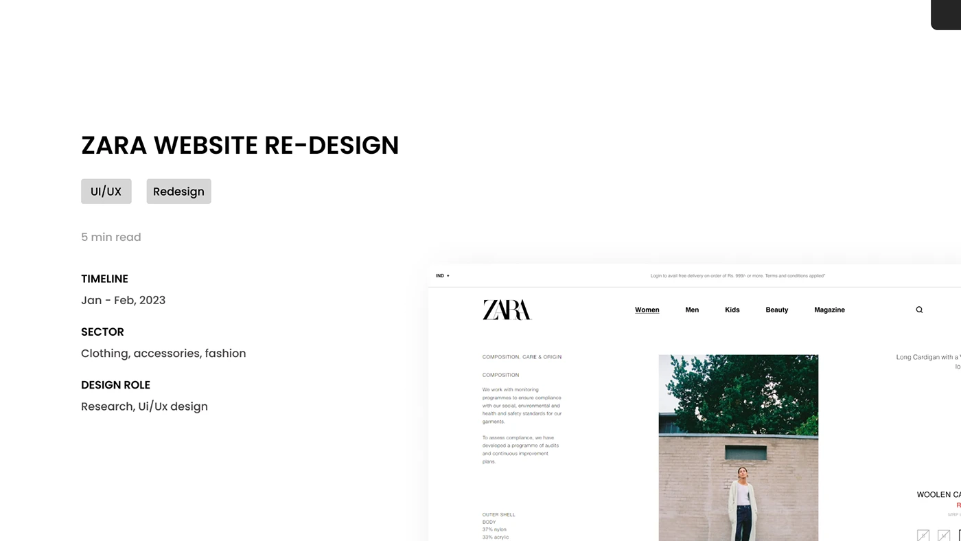
A self-initiated redesign exploration of the Zara experience. The brief I gave myself: let the product breathe, replace flat catalogue thinking with editorial rhythm, and tighten the journey from look to checkout.
Overview
Zara has always been a brand that flirts with editorial — oversized type, expressive crops, white space that feels intentional. The redesign leans further into that ethos while quietly rebuilding the underlying journey: a navigation that prioritises stories over taxonomies, a product page that doesn't shout, and a checkout that gets out of its own way.
Problem
Outline what's working and what's not in the current Zara experience, and which threads you chose to pull on.
Process
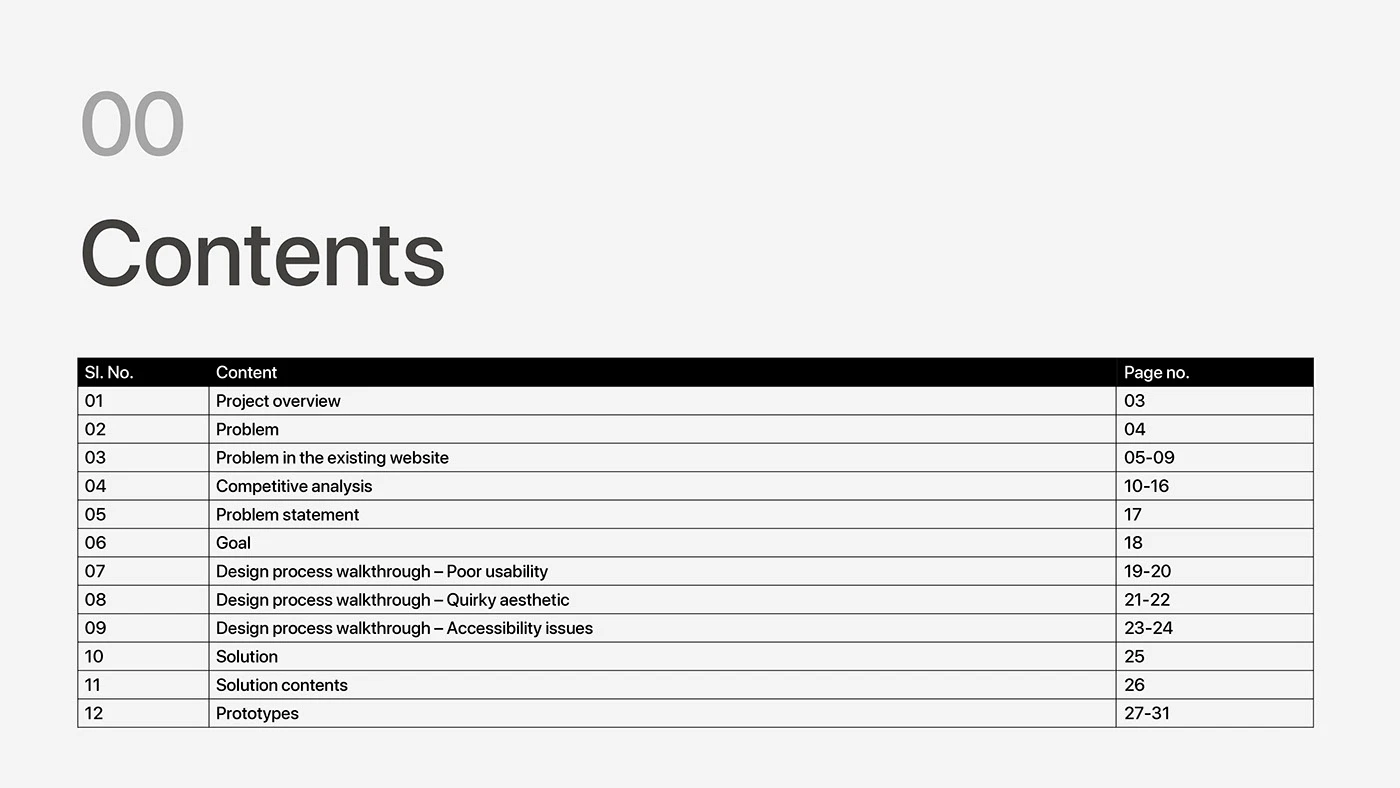
Walk through audits, competitive scans, the moodboards, and the type/grid system you developed.
Solution
Show key surfaces — home, edit/lookbook, product page, cart — and the rationale behind each.
Outcome
Capture what the redesign explored, what you learned, and any feedback you collected.
Next project
Zipline — Drone delivery app